QT Auckland takes out Australasia's Best Hotel Refurbishment
After the past month, our nagging desire for escapism has never been stronger. Travel abroad feels a world away right now, but that doesn’t mean we can’t reap the same indulgence at home. To inspire your next staycation, Remix shines a spotlight on the award-winning QT Auckland, which recently took out ‘Best Refurbishment in Australasia’ at the esteemed Paul Davis Hotel Awards.
The Paul Davis Hotel Design Awards celebrate excellence in hotel interior design for hospitality projects located in Australia and New Zealand. Judging criteria considers design innovation, response to brief, customer response and exceptional guest experience, among other design disciplines.
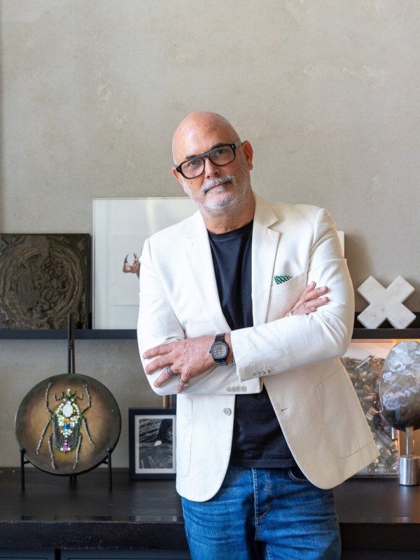
Acclaimed Australian interior designer Nic Graham is renowned for his hospitality, commercial and high-end residential projects. His eponymous studio, Nic Graham & Assoc., is celebrated for its bold use of colour, graphics and quirky memorable designs, as well as a hands-on approach.
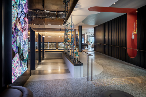
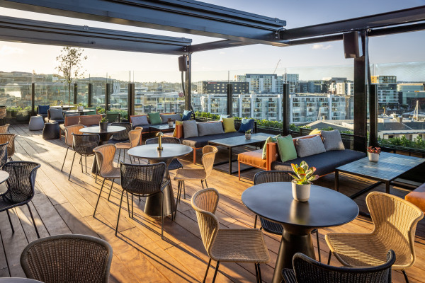
As a design partner for QT Hotels, Nic Graham was engaged by QT Auckland to inject his signature design style into the former commercial building – and that he did. Graham’s design flair literally radiates from every corner of the hotel. As soon as you step foot inside the stunning hotel, it’s easy to see why it was awarded ‘Best Refurbishment in Australasia’. QT Auckland continues to carry weight since its launch in late 2020, with eclectic spaces filled with art and soul.
Remix chats to Nic Graham to discuss the how’s and why’s behind the hotel’s key spatial designs.
QT Auckland won Best Refurbishment in Australasia, meaning you took out all the other hotels in NZ and Australia, that's huge! Why do you think it won?
There are always amazing projects being completed in this part of the world. I think QT Auckland may have been a standout due to the ‘design per square meter’ that we were able to achieve with the time frame and budget. We were able to combine some amazing, customised graphics, artwork, furniture, carpets and fittings into an inner city shell that has a really nice scale. The hotel public spaces and guest rooms have a great appeal because of the colour, texture, and cosiness of the internal spaces.
How would you describe the interior aesthetic of the QT Auckland?
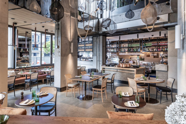
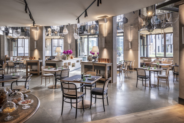
Each QT hotel is a character in its own right, reflecting its local surroundings, and QT Auckland is no exception. The QT experience and design philosophy combines local influences and lashings of quirk. At QT Auckland, we elevated the bold use of colour and created a cocooning interior that uses interesting local materials and suppliers, adding to the harbour-based neighbourhood narrative of QT Auckland. We mixed custom furniture with found objects and iconic originals, creating an unmistakable QT experience. Bold environmental graphics draw from the wonderlands of the New Zealand coast, and we proudly support local and international artists throughout the hotel.
With over 35 unique floor plans and loads of unexpected elements and materials, which part of the process did you love the most?
The first 10 percent of any project is the most exciting, when you have a blank sheet of paper and a head full of ideas. The last 10 percent is also extremely fulfilling when you see the owners, operators and staff responding to your design ideas. Design is not a science. Often, we trial ideas and concepts and surprise ourselves when they work out.
It must be challenging to create such an atmosphere and mood in every space. How do you create these original emotive spaces?
I always start with the narrative first and look at how I can tell a story through design and how it may enhance a guest experience. I question the natural light, the architectural volume, and in most instances, how to expose the raw shell, onto which we can project a polished layering of materials.
Your work as the interior designer on the QT wasn't simply cosmetic, you worked closely from the initial planning stages didn't you?
That’s right. I collaborated with the QT Auckland team, owners, and architects from the very beginning. It was important to expose the concrete shell of the existing architecture and contrast that with the rich layering of interior components.
What was the recurring mission statement or theme for the QT Auckland?
The design narrative harnesses the idea that beauty lies within. The theme of discovery is a central narrative throughout the hotel’s design experience.
What visual elements helped bring this concept to life the most? I have heard there was a subtle oyster theme.
On my first trip to Auckland, it was a freezing cold day, the ocean was a deep green-grey and the site of the soon-to-be hotel was a nondescript office building waiting to be converted into something uniquely QT. After two martinis and a dozen of Auckland’s finest oysters, it was revealed to me how treasured the oyster is in New Zealand, and rightly so. The idea of the rough outside and seductive polish of the inside was a nice metaphor for a repurposed inner city building and hotel conversion – a shell hiding the luxury that lies within. The oyster narrative is a loose one, but extends to some interior components that we used such as wall textures, bold polished colours, bespoke rugs and carpets and graphics and artworks that celebrate Auckland’s DNA and the mythical sea surrounding the land of the long white cloud.
What is your project highlight from QT Auckland?
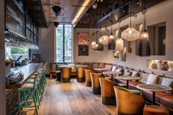
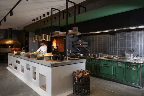
The installation in the restaurant ceiling void in Esther was a great surprise to see installed (over FaceTime for me, that is). We sent sketches to our manufacturer in Indonesia, saw some rough mock-ups and before we knew it, they were packed and shipped. They add great drama to the void and change from day to night with the light.
Esther is a fantastic space, what inspired the elements in the restaurant? Did Sean Connolly’s menus help inspire your design?
I worked closely with Chef Sean Connolly to bring to life our collective vision for Esther. A rarity for a chef and designer to work this closely, we collaborated on everything from the exact colour green for Sean’s custom French oven, to crockery, accessories and artwork. We’ve shared countless texts, Instagram tags and many meetings in my office.
You must've eaten there...What's your favourite dish?
Sean’s signature dessert, Vacherin – a deconstructed Pavlova smashed together with fresh fruit and cream at the table and ladled onto your plate.
Which space in the hotel is your special space?
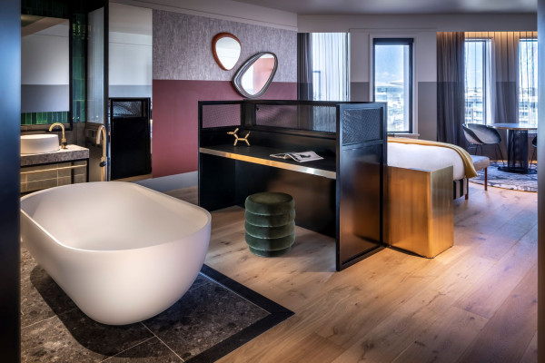
I actually love the guest rooms. They have more design per square metre than any other QT completed before. The bold use of colour is comforting, especially in the filtered afternoon or morning sun, and I love the way the black frame ribbed glass doors to the bathroom slide away to reveal the underwater green tones of the bathroom tiles. The exposed concrete ceilings are also a great reminder of the building’s former life.
Do you think lovers of the QT can emulate the mood in their own homes should they wish to?
It would be great fun to add colour blocking into a bedroom or a living space like we did in the guest rooms at QT Auckland. I also love the use of black framed mirrors to expand a space and let more light into a room when placed near to windows.
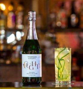
Advertisement